Here, you will find a captivating collection of graphs and code snippets, all generated using Python. This page serves as a showcase for my extensive experience in data visualization with Python, incorporating work from various sources such as homework assignments, coding projects, lab reports, my undergraduate thesis, and my role as a research assistant.
Data visualization is a powerful tool that allows us to gain insights and communicate complex information effectively. Throughout my academic journey and professional endeavors, I have honed my skills in leveraging Python’s robust libraries to create visually compelling representations of data.
Within this page, you will discover a diverse range of visualizations, each telling a unique story. From bar charts to scatter plots, line graphs to heatmaps, the possibilities are endless. By examining these visualizations, you will witness how data comes to life, revealing patterns, trends, and correlations that may otherwise remain hidden.
Accompanying each visualization, you will find carefully selected code snippets that demonstrate the underlying logic and techniques employed to generate the visual representation. These code snippets serve not only as a testament to my technical proficiency but also as a resource for fellow data enthusiasts who seek to delve deeper into the intricacies of data visualization with Python.
Scatter Plots
plt.scatter(T_array_hr, L_array_hr, c = r_array_hr, cmap = "hsv")
plt.xlabel('Log of Temperature [K]')
plt.ylabel('Luminosity [log (L/L_sol)]')
plt.title('Temperature vs Luminosity vs Radius for hr.0A', pad = 20)
plt.colorbar(label = 'Radius [cm]')
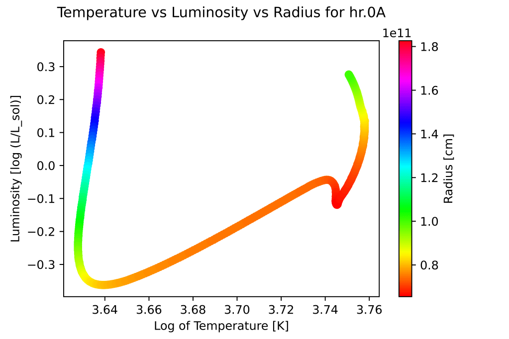
The scatter plot showcases the relationship between temperature and luminosity of a star, with the radius indicated by the color scale. The x-axis represents the logarithm of temperature in Kelvin (K), while the y-axis represents the logarithm of luminosity relative to the solar luminosity (log (L/Lsol)). Each data point corresponds to a specific object or event, and its position on the plot indicates its temperature and luminosity characteristics. The color of each point represents the radius, with a colorbar providing a visual reference for the radius values in centimeters (cm). Plotting this with a plt.scatter as opposed to plt.plot allows us to include the color change as the radius of the star changes.

x = np.linspace(-30,30,100)
mountains = ((x * np.sin(x/np.pi)+4) * (np.cos(x)/np.pi) + 14)/4 #draw some mountains
ax = plt.axes()

plt.scatter(eq_time, phx_data['Altitude'], c = days, cmap = 'spring', facecolor = 'skyblue'); #add colormap to show progression throughout year
plt.plot(x, mountains, color = 'peru')
plt.fill_between(x, mountains, color = 'peru')
ax.set_facecolor('lightskyblue')
plt.xlabel('Equation of Time [min]');
plt.ylabel('Altitude Above Horizon [deg]');
plt.colorbar(label = 'Day of Year');
plt.title('Position of the Sun at Solar Noon for Phoenix, 2021', pad = 10)
Similar to the previous plot, however this one plots the location of the sun in the sky at exactly noon throughout the year in Phoenix, Arizona. Additional embellishments such as the sky color and a crude drawing of a mountainous horizon (utilizing the plot of a sine wave) were added using Python as well.

plt.scatter(limb, svc, marker='.', c=expt)
plt.colorbar(label='Exposure Time [sec]')
plt.xlabel('Limb Angle [Deg]')
plt.ylabel('Sky-Value Correction')
plt.gca().invert_yaxis()
The scatter plot visualizes the relationship between the limb angle (in degrees) and the sky-value correction. Each data point, represented by a marker, corresponds to a specific measurement or observation. The color of each marker is determined by the exposure time, with a colorbar indicating the corresponding values in seconds (sec). To enhance clarity, the y-axis is inverted, so that more negative sky-value correction values are displayed towards the top of the plot. To keep it short, this inversion helps emphasize that more negative y-values are brighter (see my thesis for more information).
plt.figure(dpi=1200)
plt.plot(ra,skycor,'o',label='SKYCOR')
plt.plot(ra,avg_skycor,alpha=1,label='Average SKYCOR')
plt.vlines(ra, skycor, avg_skycor,'c',alpha=1,label='SKYCOR Difference')
plt.xlabel('HST-Sun RA Difference [deg]', fontsize = 14)
plt.ylabel('Sky Value Correction [e-/s]', fontsize = 13)
plt.title('Relation of SKYCOR and SKYCOR Diffrence',pad=10,fontsize=16)
plt.tight_layout()
plt.minorticks_on()
plt.legend(loc=4)
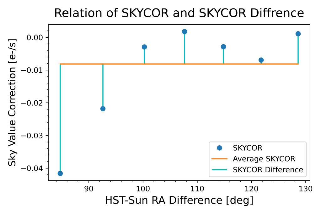
The following plot consists of three components:
- Blue dots (‘o’) represent the individual sky value correction values (SKYCOR) corresponding to different HST-Sun RA differences.
- The orange line represents the average sky value correction (avg_skycor) as a function of HST-Sun RA difference.
- The cyan vertical lines (vlines) connect each data point to the corresponding average sky value correction, highlighting the difference between SKYCOR and avg_skycor.
The plot aims to illustrate the relation between SKYCOR and its difference from the average value. The legend provides labels for each component, making it easier to identify and interpret the different elements of the plot (see my thesis for more information).
Heat Maps

plt.xlabel('Planck Constant Test Values [J/s]')
plt.ylabel('Temperature Test Values [K]')
plt.title('Test Planck Constant Values vs Test Temperature', pad = 15)
plt.imshow(np.log(bb_list), extent=[2*10**(-34), 1*10**(-33), 2.5, 3], aspect = "auto", cmap = 'nipy_spectral')
plt.colorbar(label = 'RMS Value')
The plot represents a visualization of test values for the Planck constant (in Joules per second) and temperature (in Kelvin). Overall, this plot allows for a visual exploration of the relationship between the test values for the Planck constant and temperature, providing insights into their interplay. We can utilize this heat map to visualize where the RMS is at a minimum and pinpoint what the true value of the Planck constant is.
Hexbins

plt.hexbin(x=limb, y=ra, C=sk, gridsize=80, cmap='coolwarm_r', vmin=-0.1, vmax=0.1);
plt.colorbar(label = 'Sky Value Corrections [e-/s]');
plt.ylabel('HST-Sun Right Ascesnsion Difference [Deg]');
plt.xlabel('Earth Limb Angle [Deg]');
plt.title('Sky Corrections as a function of Limb Angle and RA Difference', pad=20);
The hexbin plot divides the data into hexagonal bins, with the color of each bin representing the aggregated sky value correction values within that bin. The x-axis represents the Earth limb angle, while the y-axis represents the HST-Sun right ascension difference (see my thesis for more information).
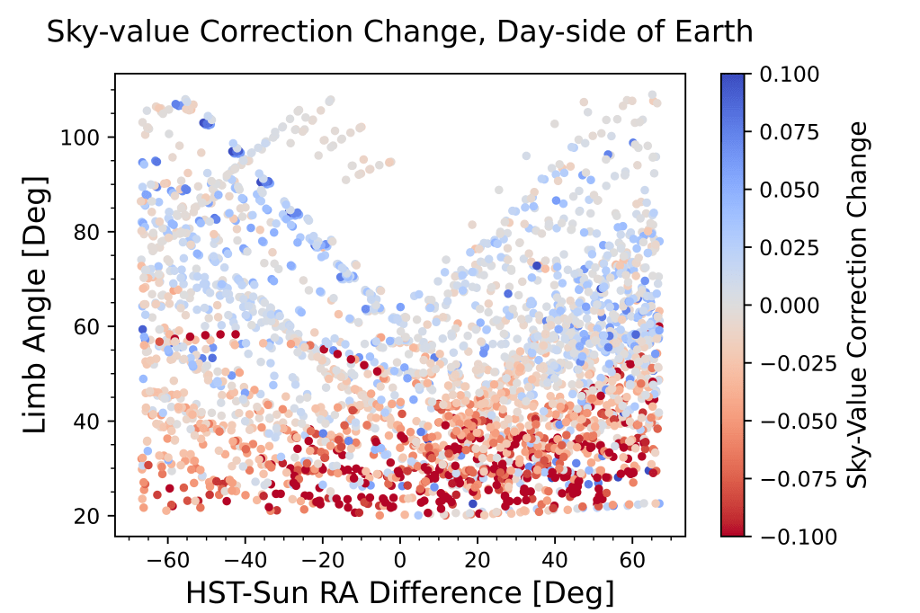
plt.figure(dpi=1200)
plt.hexbin(x=ra, y=limb, C =skdif , gridsize = 60, cmap = 'coolwarm_r', vmin = -0.1, vmax = 0.1);
plt.colorbar(label = 'Sky Value Correction Difference [e-/s]');
plt.ylabel('Earth Limb Angle [Deg]');
plt.xlabel('HST-Sun Right Ascesnsion Difference [Deg]');
plt.title('Sky Corrections as a function of Limb Angle and RA Difference', pad = 20);
This plot is the same as the previous but translated and cut to only include data on the day-side of the earth.
Plotting from Multiple Data Locations

color = cm.cool(np.linspace(0, 1, 8))
mass = 0.5
for i,c in zip(sort_data_dir, color):
    if (mass*10)%3 == 0:
        stellarModel = open(os.path.join(data_dir_path + i), 'r')
        filename = str(i)
        j = 1
        tstep = 0

        dataframe_hr = pd.read_table(stellarModel,delim_whitespace=True,names=np.arange(14))
        nrows = np.shape(dataframe_hr)[0]

    #Code reads in log(temperature) (T), log(luminosity/Lsol) (L), time in seconds (t), and stellar radius in cm (r).
        T_array_hr = []
        L_array_hr = []
        t_array_hr = []
        r_array_hr = []
        for j in range(nrows):
            if j%19 == 0:
                T_array_hr.append(dataframe_hr[8][j])
                L_array_hr.append(dataframe_hr[7][j])
                t_array_hr.append(dataframe_hr[2][j])
                r_array_hr.append(dataframe_hr[4][j])
        hab_rad_in = []
        hab_rad_out = []
        for i,k in zip(T_array_hr, L_array_hr):
            hab_rad_in.append(hab_zone_inner(k,i))
            hab_rad_out.append(hab_zone_out(k,i))

        stellarModel.close()

        plt.plot(t_array_hr, hab_rad_in, label = str(round(mass, 1)) + ' $M_{\odot}$' + " inner", c = c, linestyle = 'dashed');
        plt.plot(t_array_hr, hab_rad_out, label = str(round(mass, 1)) + ' $M_{\odot}$' + " outer", c = c);
        #plt.plot(t_array_hr, hab_rad_out);
        #plt.scatter(t_array_hr, hab_rad_in);
    else:
        pass
    mass += 0.1
plt.xlabel('Time [sec]');
plt.ylabel('Radius [AU]');
plt.xscale('log')
plt.title('Inner and Outer Habitable Zone Radius for Various Masses', pad = 10)
plt.legend(loc='center left', bbox_to_anchor=(1, 0.5))
This code generates a plot illustrating the variation of the inner and outer radii of the habitable zone for different stellar masses over time. Since the data for each stellar type is held in different files the code loops through the files and pulls data out of each to plot. In this case, the (mass*10)%3 == 0 was utilized to only select a few stars to not overcrowd the plot.
Modeling

H = n*mu0*dat_pGe['MagCurr(Amp)']
a,b = np.polyfit(H,dat_pGe['B(kG)'],1)
plt.figure(dpi=1200)
plt.scatter(dat_pGe['MagCurr(Amp)'],dat_pGe['B(kG)'], marker=',', s=1)
plt.plot(dat_pGe['MagCurr(Amp)'], a*H+b, linewidth=2, c='orange');
plt.legend(labels=[f'Linear Fit\n$m$ = {np.round(a, 3)}', 'Data Points'])
plt.title('Current vs Magnetic Field')
plt.ylabel('Magnetic Field [kG]')
plt.xlabel('Current [Amp]')
plt.grid()
plt.tight_layout()
This code generates a plot showing the relationship between current and magnetic field using a scatter plot for the data points and a linear fit line. The legend provides information about the linear fit. The plot also includes a grid for better visualization.
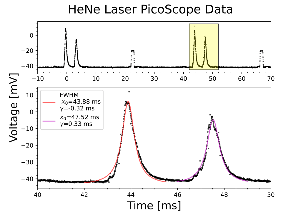
#first peak
peak1=hene_pico_agg.loc[(hene_pico_agg['(ms)']>42)&(hene_pico_agg['(ms)']<45.5)] #pick two points on either side of peak to isolate
p1 = [10, 44, 2, -42] #guess parameters from data
popt1, pcov1 = sp.curve_fit(lorentzian, peak1['(ms)'],peak1['(mV)'], p0=p1) #find fit parameters fitting model to data
perr1 = np.sqrt(np.diag(pcov1)) #find error of parameters
x1_fit = np.linspace(42, 45.5, 1000) #create array of wavelengths
y1_fit = lorentzian(x1_fit, *popt1) #create model output data

#second peak
peak2=hene_pico_agg.loc[(hene_pico_agg['(ms)']>46)&(hene_pico_agg['(ms)']<49)] #pick two points on either side of peak to isolate
p2 = [10, 47, 2, -40] #guess parameters from data
popt2, pcov2 = sp.curve_fit(lorentzian, peak2['(ms)'],peak2['(mV)'], p0=p2) #find fit parameters fitting model to data
perr2 = np.sqrt(np.diag(pcov1)) #find error of parameters
x2_fit = np.linspace(46, 49, 1000) #create array of wavelengths
y2_fit = lorentzian(x2_fit, *popt2) #create model output data


# Create subplots with custom height ratio
fig, axs = plt.subplots(nrows=2, ncols=1, figsize=(7,5), dpi=1200, gridspec_kw={'height_ratios': [1, 2]})

#first subplot with rectangle
#plot all aggregated picoscope data
axs[0].scatter(hene_pico_agg['(ms)'], hene_pico_agg['(mV)'], c='k', marker='+', s=1, alpha=1)
#create a rectangle to highlight subset data in plot 2
rect = plt.Rectangle((42, -45), 10, 60, linewidth=0.5, edgecolor='k', facecolor=(1,1,0,0.25))
#draw rectangle to highlight
axs[0].add_patch(rect)
#set x axis to make more legible
axs[0].set_xlim(-10,70)
#turn on minor ticks
axs[0].minorticks_on()

#second subplot
#plot data
axs[1].scatter(hene_pico_agg['(ms)'], hene_pico_agg['(mV)'], c='k', marker='+', s=5, alpha=0.75)
#plot first peak model fit
axs[1].plot(x1_fit, y1_fit, 'r', linewidth=1.5,alpha=0.6, label='FWHM \n $x_0$=' + str(round(popt1[1], 2)) + ' ms \n' + '$\gamma$=' + str(round(popt1[2], 2)) + ' ms')
#plot second peak model fit
axs[1].plot(x2_fit, y2_fit, 'm', linewidth=1.5,alpha=0.6, label='$x_0$=' + str(round(popt2[1], 2)) + ' ms \n' + '$\gamma$=' + str(round(popt2[2], 2)) + ' ms')

axs[1].set_xlabel('Time [ms]', labelpad=5, fontsize=18) #create x label for whole plot
axs[1].minorticks_on() #turn on minior ticks
axs[1].set_xlim(40,50) #set x axi
s to only show the subset of data fitted by model
axs[1].legend() #include legend

plt.suptitle('HeNe Laser PicoScope Data', fontsize=20) #title for whole plot
plt.subplots_adjust(top=0.9) #adjust position of title


plt.gcf().text(0.03, 0.5, 'Voltage [mV]', va='center', rotation='vertical', fontsize=18) #create y axis label
One of the more involved plots I have made yet. This plot fits a Lorentzian function to two peaks in the PicoScope data of a HeNe laser. The plot then includes two subplots: the first showcases the entire range of data with the subset of data used the in the second plot highlighted, the second showcases the Lorentzian fit for each peak.
